
07584-


OPPOSITE ENDS OF THE SPECTRUM
Branding -
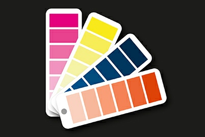
Colour plays an important role in marketing and advertising. A graphic designer should always take into account how people interpret colour as different colours portray different ideas and meanings whether the viewer is aware of this or not. In this blog, we examine each of the main ten colours in the spectrum and explore what each colour means and give examples of their use. (For more information on Colour Management click here)
Red
Red is a powerful colour. It is bold and energetic and conveys emotions of danger, passion, excitement, confidence and energy. Red should be used with discretion, but it is a great colour to stand out from the crowd.
Orange
Orange is fun and youthful. It combines the warmth of red with the optimism of yellow and communicates activity and energy. Because of this orange is more suited to youthful rather than traditional or serious brands.
Yellow
Yellow is one of the most visible colours from a distance. It conveys optimism, friendliness, joy and energy. It can also be a cautionary colour. Some shades of yellow can appear cheap, so make sure that your research and design is right for your product.
Green
Green has two meanings, one being nature and the environment. The other is associated with finance and wealth. The shade of green used is important. Lighter shades indicate growth and vitality, whereas darker shades represent prestige and wealth.
Blue
Blue is one of the most popular colours due to the fact that it conveys reliability and trustworthiness. It is also calming and harmonious. Consider the shade of blue used as it may be a popular choice in your market.
Purple
Purple is associated with royalty and opulence. Darker shades indicate luxury, whereas lighter shades relate to nostalgia. Although associated with Cadbury's, purple is not a popular colour for branding.
Brown
Brown has become a popular choice of colour as organic and natural products continue to trend. It is wholesome, ordered and grounded. A good choice if you wish to convey the message that your brand has better things to be concerned about than colour.
Pink
Pink has long been stereotypically linked to being feminine. However, this is not the case as the shade of pink can be related to sentiment at one end of the spectrum and energy and fun at the other. Identify the mood and feeling you want to portray before selecting the shade of pink to be used.
Black
Black is serious. It represents power, luxury and sophistication. Black will always be a classic colour. Texture and finishes, whether matt or gloss, will help to define how your brand is portrayed.
White
Finally, white represents simplicity and perfection. It is pure and can be used to convey a minimalist aesthetic. Make sure your brand values are simple and pure before using white as your colour.
Please note that the views, thoughts, and opinions expressed in this article belong solely to the author, and not necessarily to any other group or individual. To ensure you are fully compliant with all current legislation, please take legal/professional advice and do not rely solely on the information provided in these articles.

Copyright © 2018-
Terms of Use | Privacy Policy, GDPR & Cookie Policy | Trading Terms


