

07584-


FIFTY SHADES
Printing -
Colour plays such an important role in marketing and branding and therefore colour management is a critical part of the print process. The term colour management refers to the procedure used to achieve exact colour reproduction and to make specific colour matching possible during printing. Different devices have different colour characteristics, the monitor, the software, how the artwork is saved, the colour proofer, the printing press… the list goes on.
The only way to manage these variations in colour is to standardise the data so that all the devices can utilise this information to identify any issues to ensure the end colour matches the intended shade. So how is this possible?
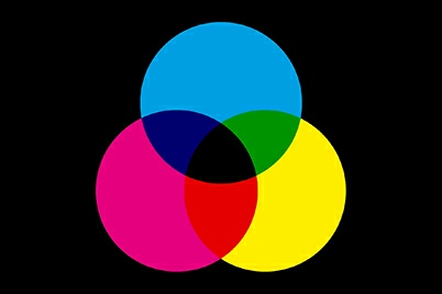
Keep all your colours in the same mode. Most software defaults to RGB whereas professional printers will use CMYK. If you have created your design in RGB, there will be a noticeable difference from how it looked on-
Perfect colour reproduction can be achieved by using the Pantone Colour Library. This is essentially a library of colour swatches, with each swatch assigned a unique reference number. By quoting that reference number, the printer can mix the inks to an exact formula & also cross reference the colour on press. (For more information on Colour in Design click here)
Another way to achieve consistent colour is by using ICC colour profiles. ICC stands for International Colour Consortium and is a collection of data that covers all the variables associated with printer & ink performance, environmental conditions and media. ICC colour profiles are vital, as RGB and CMYK do not have any values unless associated with a colour profile. All publishing houses will have their own colour profile that needs to be embedded in the artwork so that elements such as the printing press, the weight & colour of the substrate and the ink used does not interfere with the colour correctness of the final print.
All this may seem a lot of effort to match a few colours, but the end results will be worth it. Always discuss the project in the initial stages with your designer or printer as expert knowledge will help you achieve better colour consistency.
Please note that the views, thoughts, and opinions expressed in this article belong solely to the author, and not necessarily to any other group or individual. To ensure you are fully compliant with all current legislation, please take legal/professional advice and do not rely solely on the information provided in these articles.
Copyright © 2018-
Terms of Use | Privacy Policy, GDPR & Cookie Policy | Trading Terms


