

07584-


BUSINESS LETTER
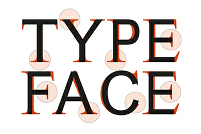
Branding -
Choosing a typeface can be difficult. With unlimited amounts of options now available, deciding on the most suitable typeface to work with your design can be a bit of a headache. Unfortunately, there are no hard and fast rules on this subject, but there are a few tried and tested principles that can be applied to make the selection process much simpler.
1. Impression
The first thing to consider is how you want your audience to react to your text. Before you commit to using the typeface, study each individual letter to see what emotion it conveys to you. Does it evoke excitement, calm, trust etc. The choice of typeface should also have a good combination of legibility and readability whilst remaining appropriate for the intended audience.
2. Legibility
Legibility refers to the design of the typeface. Decorative typefaces have low legibility whereas typefaces designed for novels and newspapers have a high legibility. Typefaces with conventional letterforms should be chosen for high legibility as other types of decorative letters will affect how quickly the reader comprehends the message that is in front of them. Individual letters should have generous spaces (known as tracking) in between them, again to allow the reader to quickly process the text.
3. Readability
Readability is determined by the type style, its size and colour. If your message is complicated, a high level of readability is required to help the reader easily understand the text. If the text is too pale in colour, or the tracking is too narrow, this will hinder the message being fully understood.
4. Serif Typefaces
A serif is a small line or stroke that is attached to the end of the larger stroke on a letter or symbol. This is known as a Serif typeface. Examples of this include Times, Caslon and Baskerville. Originating from the Latin alphabet, these fonts are considered traditional in their roots, although more contemporary versions such as Garamond, Palatino and Sabon are now a popular choice.
5. Sans Serif Typefaces
A Sans Serif typeface is the opposite to a Serif typeface in that it does not have extended features at the end of the strokes of each letter. This typeface is widely used in digital projects, as Serif typefaces may lose their detail on smaller displays or devices. Considered to be more contemporary in appearance, examples of Sans Serif typefaces include Helvetica, Arial, Gill and Optima.
6. Safe Typefaces
A large number of typefaces used are classed as ‘safe’ typefaces. It is sometimes better for a typeface to be clear and legible rather than unreadable as this defeats the object of clear communication. Examples of ‘safe typefaces’ include Arial, Verdana & Helvetica (Sans Serif versions) and Georgia, Palatino & Times New Roman (Serif versions).
7. Hierarchy
Hierarchy is a way of converting a block of text into separate statements. From this, you may want some statements to appear more noticeable than others. Once you have done this, you may need a number of fonts to cover your headings, sub-
The above principles are only guidelines. Sometimes it is necessary to trust your intuition and break the rules to make sure your message is portrayed at its best. However, if in doubt stick with classic typeface combinations. Your design may lose its edge, but the overall integrity of your message will prevail.
Please note that the views, thoughts, and opinions expressed in this article belong solely to the author, and not necessarily to any other group or individual. To ensure you are fully compliant with all current legislation, please take legal/professional advice and do not rely solely on the information provided in these articles.
Copyright © 2018-
Terms of Use | Privacy Policy, GDPR & Cookie Policy | Trading Terms


